Bar Chart: What It Is, Technical Analysis, Examples and Types

If you are into trading you definitely heard about various price charts: bars, candlesticks, columns, and others. In this article we will have a closer look at one of the most popular and versatile of them - the bar chart, which is commonly used by trades to analyze trends and periods in the financial markets. Whether you are new to trading or looking to refine your skills, a clear understanding of bar charts can enhance your market analysis, so stay tuned.
Table of Contents
Key Takeaway
What Is a Bar Chart?
Bar Patterns
Types
Benefits
Bar Chart vs Histogram vs Column Chart
Bar Chart vs Candlestick Chart
Conclusion
FAQs
Key Takeaways
-
A bar chart in trading displays the price action of an asset over a specified period.
- Every price bar contains a vertical line showing the highest and lowest prices and short horizontal lines on either side for the opening and closing prices.
- These charts are commonly used to analyze market trends, identify price volatility, and spot potential reversal points.
What Is a Bar Chart?
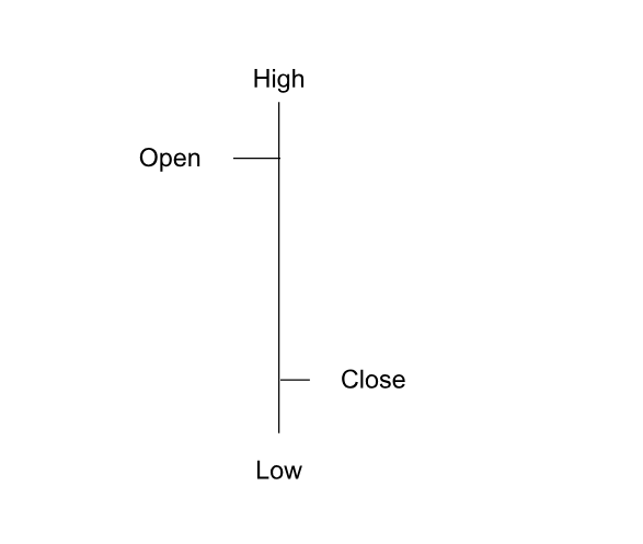
A bar chart is a visual tool in trading that illustrates the changes in value of an asset during a certain timeframe. Each bar on the chart represents a single period, such as a day, week, or hour, depending on the trader's preference. The vertical line in each bar stands for the asset's highest and lowest prices during that period. The horizontal ticks on the left and right indicate the opening and closing prices, respectively.
Bar Chart Explained
Bars are a specific form of a trading chart that consists of vertical and horizontal lines.
- Vertical lines represent the high and low prices
- Horizontal ticks show the opening and closing prices
A bar closing higher than its opening is usually viewed as bullish, signaling upward momentum. The reverse, in turn, indicates bearish market sentiment.
Bars help traders analyze market information and pinpoint possible chances for trade in technical analysis. Traders can assess market volatility and overall sentiment for a specific time frame by analyzing the high, low, opening, and closing prices on each bar. A longer bar signifies greater price fluctuation, while a shorter one represents more stability, based on the bar's length as an indicator of price range.
Bar Patterns
Bar patterns on a chart are crucial for traders to identify potential market movements and to evaluate overall market sentiment. Identifying these trends can help traders predict if the market is experiencing an upward trend, a downward trend, or moving sideways. Here are some popular bar patterns:
-
Up-Day and Down-Day. A day with an increase in closing price compared to the day before is known as an up-day. This pattern signals a potential bullish trend. On the contrary, a day with a decreased closing price compared to the day before is known as a down-day. It indicates negative market sentiment.
- Inside-day and outside-day. The inside-day pattern occurs when the bar’s high and low are within the previous day’s range. It often signals consolidation and can precede a continuation of the existing trend. An outside day is characterized by a bar that includes the range of the previous day and has a higher high and a lower low. This may signal significant momentum in one direction and typically indicates confirmation of the trend.
- Trading range. This pattern happens when the market trades horizontally within a specified range, with prices fluctuating between levels of support and resistance. It signifies a time of uncertainty before a possible rally or decline.
- Reversal patterns. Reversal patterns indicate a potential change in trend direction. Examples include key reversals, where a bar shows a strong move against the prevailing trend, and double tops or bottoms, signaling a potential market reversal.
Spikes
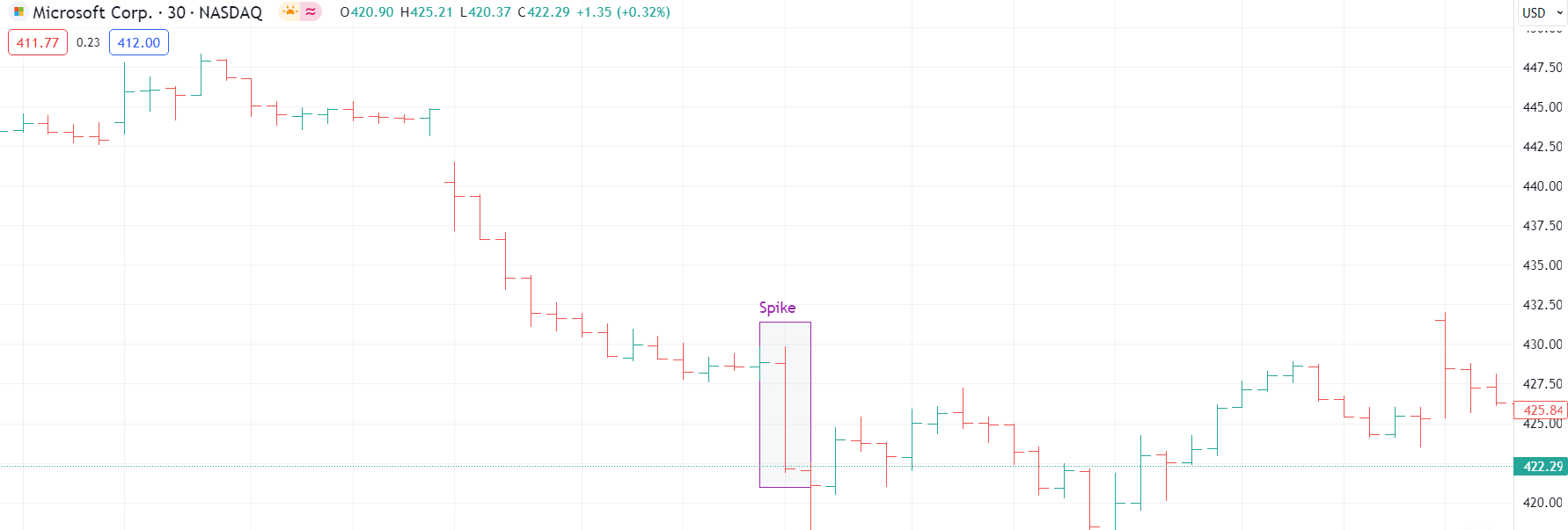
Spikes, also known as long bars signify rapid and sometimes abrupt price changes within a short daily trading range, usually triggered by unexpected news or events.
A spike can serve as a key reversal signal, especially if it occurs after a prolonged trend. For instance, a sudden increase in an uptrend might reflect a peak in purchasing, indicating a potential change in direction soon. On the other hand, a sudden spike in a downtrend could indicate a rush among sellers, possibly indicating the lowest point of the market.
Price Gaps
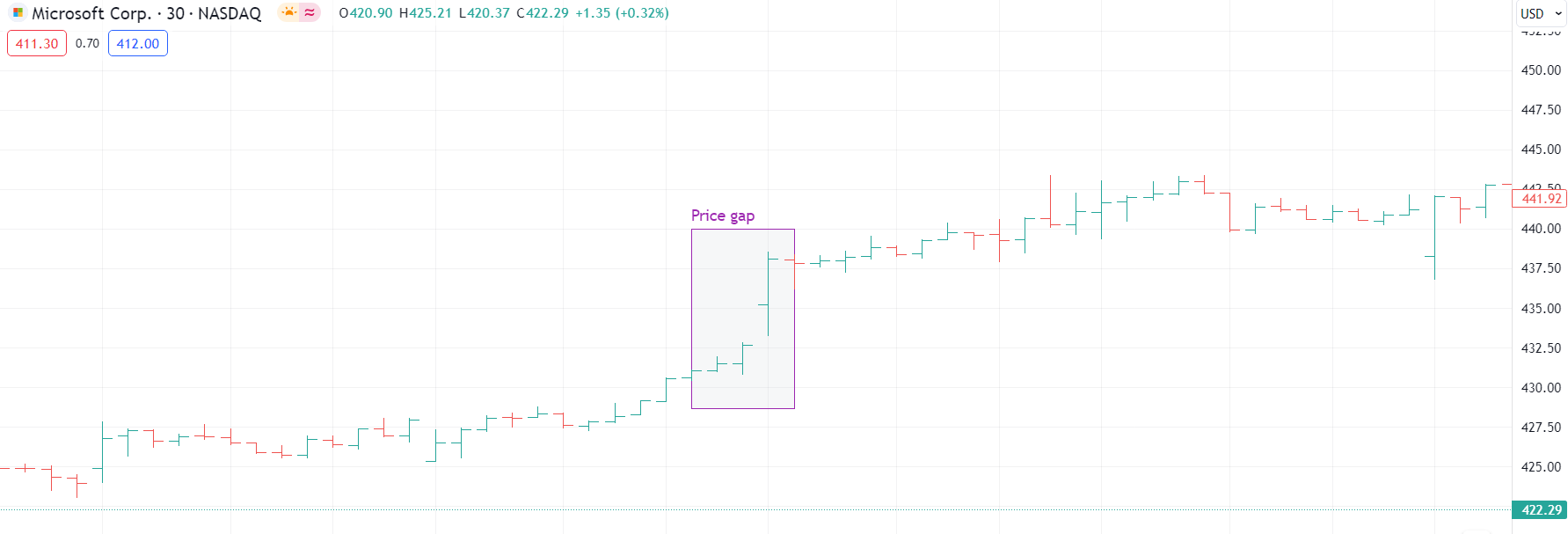
Price gaps occur when there is a noticeable difference between the closing price of one day and the opening price of the next, with no trading activity in between. They are commonly divided into several types.
-
Upside gap happens when the opening price surpasses the previous day’s high. This is commonly viewed as a positive sign, showing significant demand for buyers.
- Downside gap occurs when the opening price is below the previous day’s low, indicating a bearish outlook and the possibility of further decrease in the market.
- Common gap is usually found in a trading range. These gaps are frequently filled when prices return to previous levels.
- Breakaway gap indicates the beginning of a new trend, frequently observed at the onset of a breakout from a trading range.
- Exhaustion gap usually occurs close to the end of a trend and comes before a reversal, as the final push in the trend loses momentum.
- Runaway gap happens in an ongoing trend and indicates its powerful potential for continuation.
- Island reversal is a rare but powerful pattern, where a gap is followed by a consolidation and then another gap in the opposite direction. It usually represents a drastic shift in trend.
Types
There are several types of bar charts.
-
Standard price bar. This is the most common type. It displays the highest price, lowest price, opening price, and closing price for a specified time period. The left tick marks the opening price, while the right tick marks the closing price.
- Range bars. These charts focus only on the range between the highest and lowest prices, they don’t display the opening and closing prices. Range bar charts are beneficial for illustrating market volatility without the distraction of additional data points.
- Volume bars. Volume bars incorporate trading volume in addition to price data, offering a more comprehensive image of market activity.
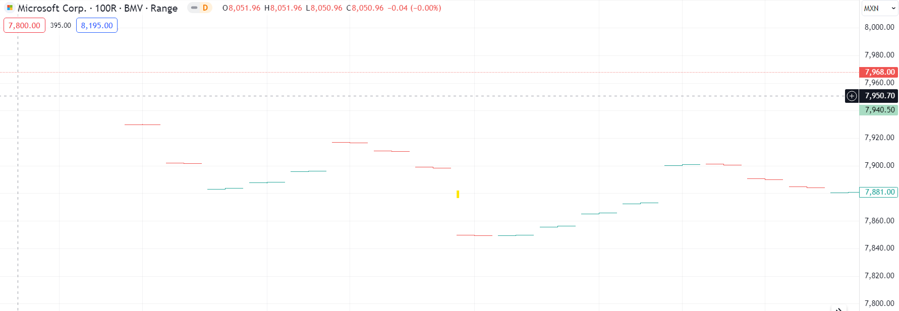
Example #1
Let’s consider an example of a stock chart. We can see a consistent uptrend on the chart, as such the majority of the bars have a green color. In the middle of this bar chart, there are two green spike bars which represent a rapid price change during a short period of time. In this case, spikes resulted in a short downward momentum and market indecision that soon after pulled back to the upward trend.
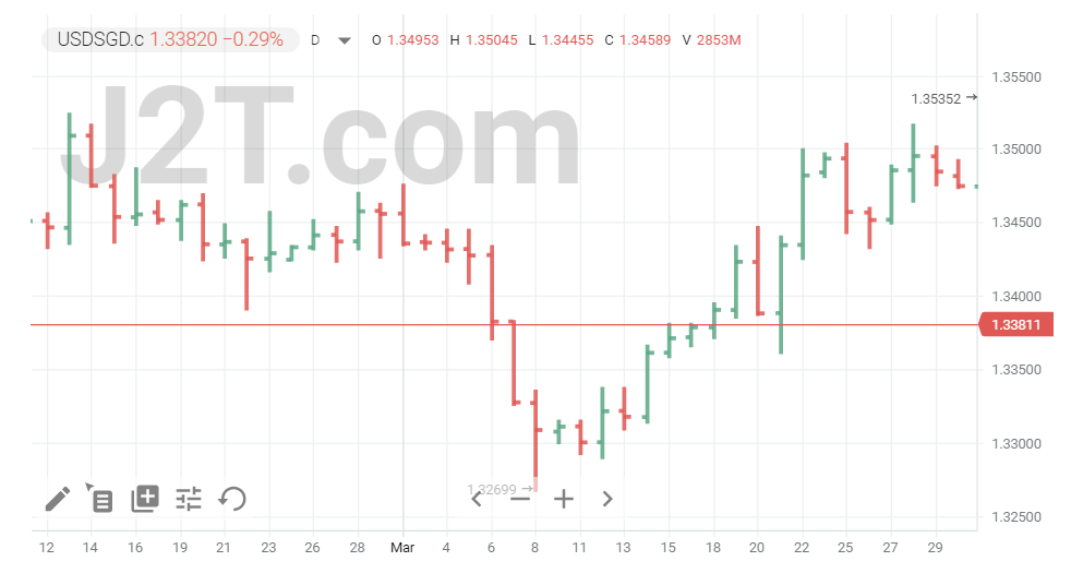
Example #2
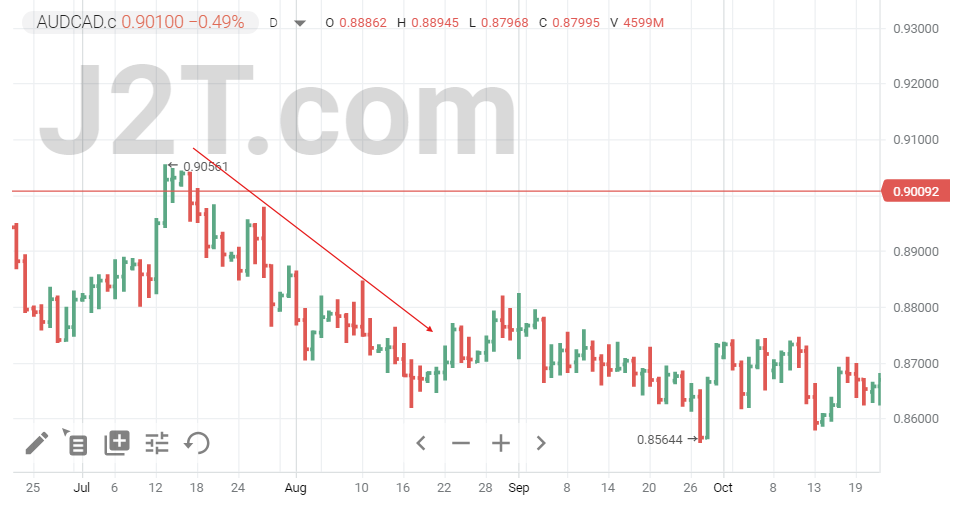
Here is another example on the forex bar chart in conditions of the falling market. As the prices are going down, we can see that there are more red bars than green ones, which helps us better visualize the main market sentiment. Moreover, it’s important to note that on a bearish market, the bars are usually getting longer, this way reflecting the growing price volatility.
Benefits
Here are some of the key benefits of using bar charts in trading:
-
Historical analysis. Bars help traders to assess previous price fluctuations and trends to anticipate future market trends.
- Support and resistance levels. With bar charts, you can identify key support and resistance levels, which are critical for setting entry and exit points in trades.
- Volatility assessment. The length and shape of the bars provide insights into market volatility. Longer bars indicate greater price fluctuations and potential trading opportunities.
- Price patterns. Bars allow traders to easily spot technical analysis patterns such as double tops, double bottoms, and head and shoulders, which can indicate potential market movements.
- Identification of market trends. Visualization of price progression over time on a bar chart helps traders identify and confirm market trends more easily.
Bar Chart vs Histogram vs Column Chart
Even though bar charts, histograms, and column charts may look similar, they have distinct roles in analyzing data. Let’s have a closer look.
As we have already mentioned above, bar charts display individual price data for specific time periods. They show high, low, opening, and closing prices, which makes them essential for analyzing market trends and volatility.
Histograms, in turn, show the spread of numeric data, commonly employed to display frequency distributions or probability distributions within a dataset. Unlike bars, histogram charts do not concentrate on specific time-based data points.
Column charts are similar to bar charts. However, they are typically used for comparing categories of data rather than time-based data. In trading, they are less common but can be used to compare different assets (forex, futures, indexes, etc.) or market segments over the equal timeframe.
Bar Chart vs Candlestick Chart
Both bar charts and candlestick charts are essential tools in technical analysis. In contrast to bars, candlesticks offer the same data but with a little bit more visual twist. Candles consist of colored bodies to indicate bullish and bearish trends: typically, green or white for bullish (closing price above the opening) and red or black for bearish (closing price below the opening). This color coding makes it easier to quickly gauge market sentiment, helping traders make informed decisions.
Conclusion
Bar charts are an essential tool in technical analysis. They provide a clear representation of price movements over a determined timeframe, outlining important price data, such as high, low, opening, and closing prices.
However, don’t forget that as with any other trading tools, bar chart signals as well as patterns are not to be taken for granted. Thus, it’s recommended to combine this tool with other technical analysis instruments.
FAQs
What is a bar chart in trading?
A bar chart represents the price action of an asset over a specific period, like a day or a week. Each price bar displays the highest and lowest prices, along with the opening and closing prices.
What is the difference between a line chart and a bar chart in trading?
A line chart shows the closing prices over time, forming a continuous line. A bar chart provides a more detailed view with price bars, displaying opening, closing, high, and low prices.
What is the difference between candlesticks and bars in trading?
Candlesticks and bars both depict price action. Candlesticks use colored bodies to show the range between opening and closing prices. Bars use a single vertical line for high-low range and ticks for opening and closing.
What can a bar chart tell you?
A bar chart can indicate market trends, volatility, and potential reversal points. By analyzing price bars, a trader can identify patterns like higher highs, inside days, and key support and resistance levels.